Stories people actually read: 10 text design rules with examples
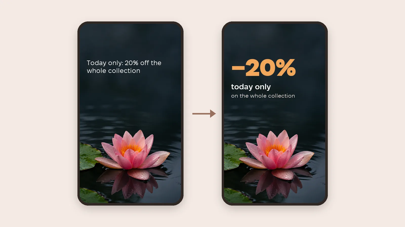
Stories get swiped in a second, so text has to read at a glance. Here are 10 rules for styling text in Stories with before-and-after examples, plus Meta's safe zones so buttons and the profile label don't cover what matters.
Why don't people finish your Stories?
People look at a Story for a few seconds and swipe on if the text doesn't land straight away. The problem is usually not what you say but how it looks: tiny type, text on a busy background, one solid paragraph. Below is what to fix and how it looks.
10 rules with examples
1. Add contrast
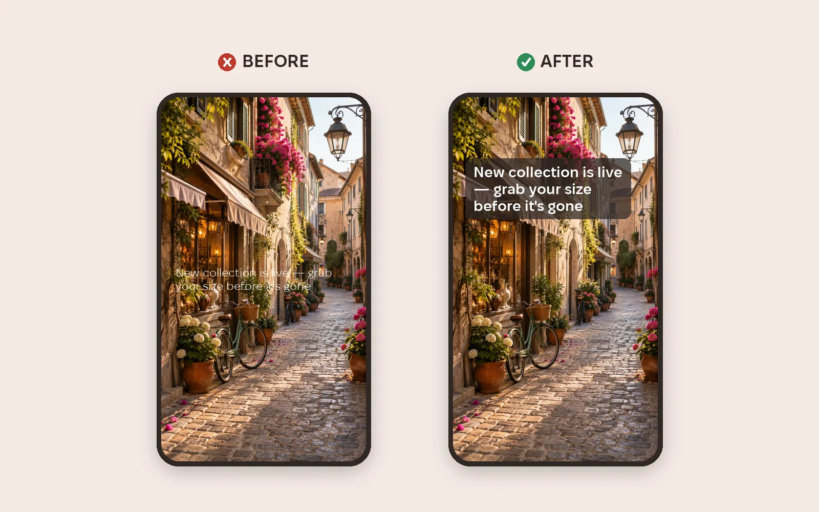
Light background, dark text; dark background, light text. If the background is busy, put a semi-transparent panel behind the text. For regular text the WCAG accessibility standard recommends a contrast of at least 4.5:1.
2. Make text bigger
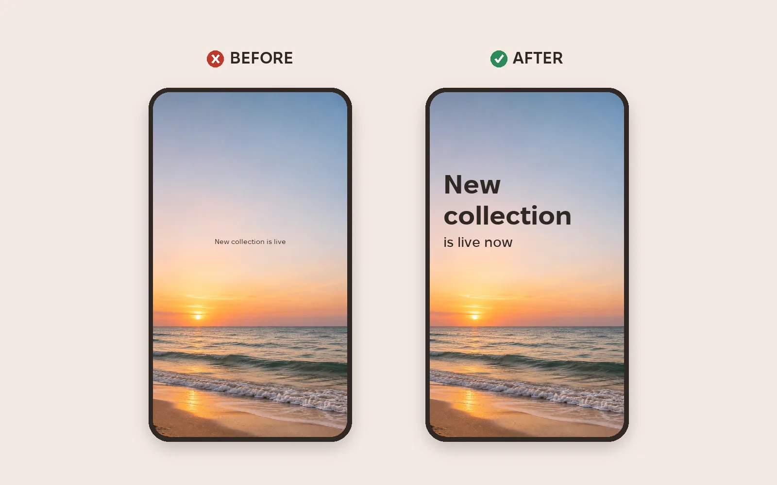
Small text on a phone simply gets skipped. Make the headline big and the supporting line noticeably smaller.
3. Break up the text
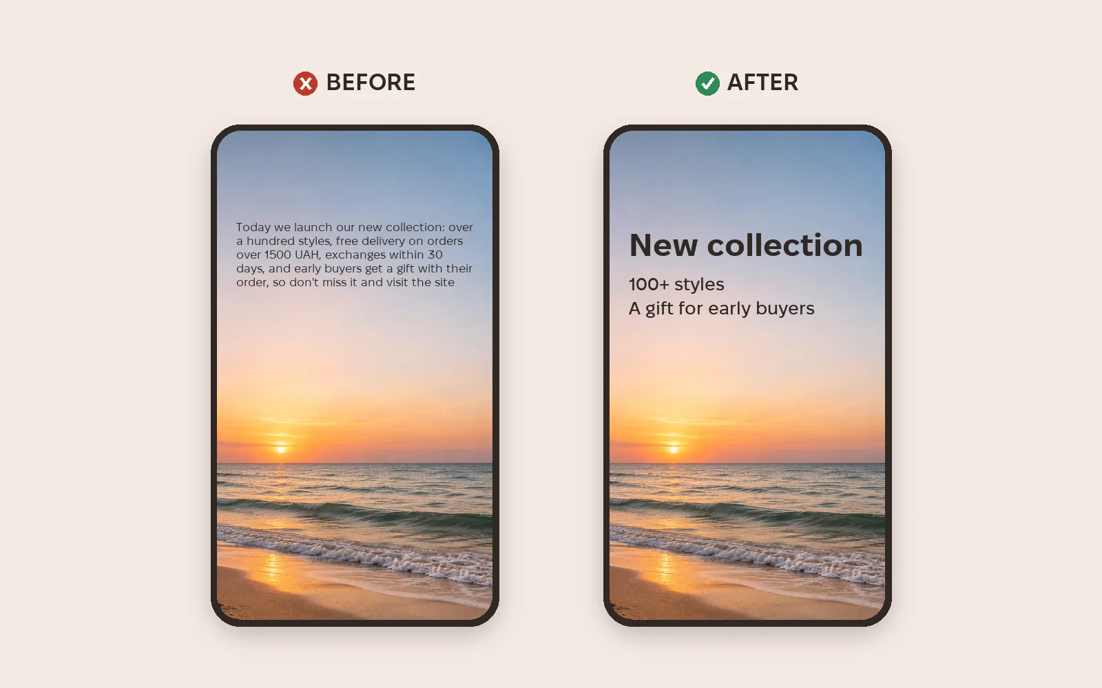
Nobody reads a solid paragraph in a Story. Keep a headline and two or three short lines; move the rest to the next Story.
4. Align the text
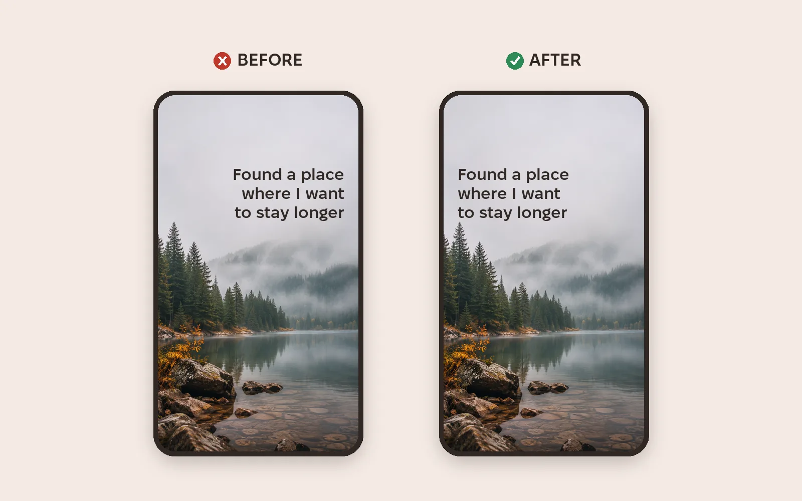
We read left to right, so right-aligned text is harder to read. Left alignment is easiest; centered works for short phrases.
5. Align blocks with each other
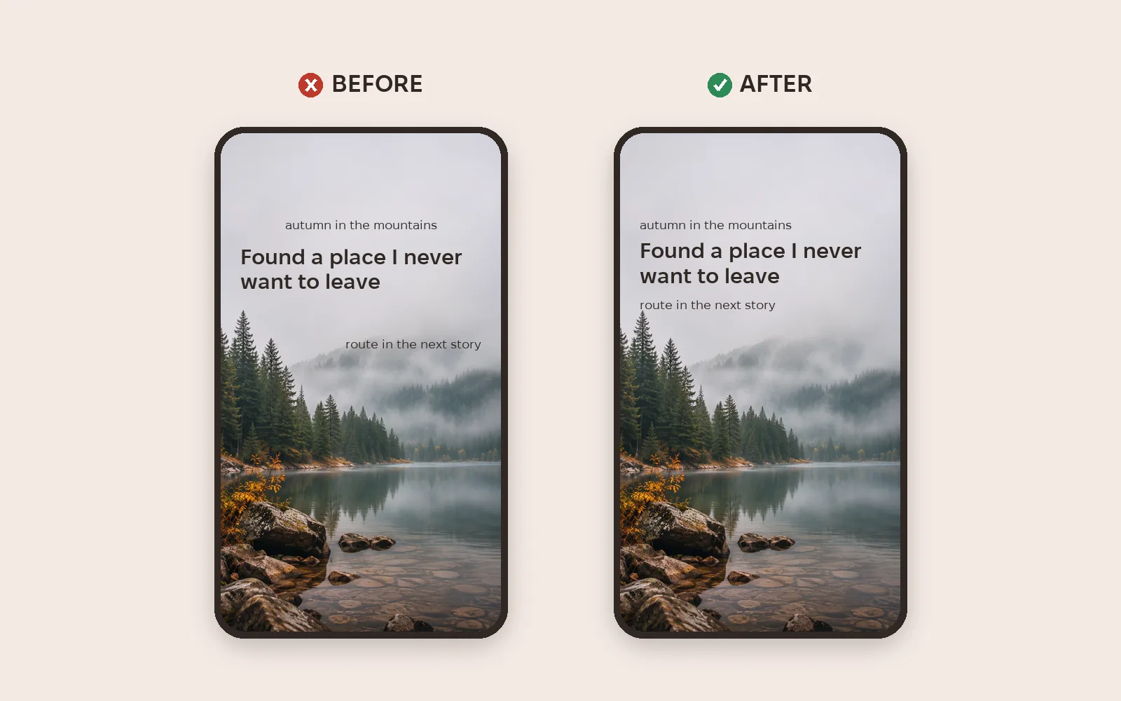
When the caption, headline and note sit at different edges, the eye jumps around. Line every block up on one edge.
6. Work on accents
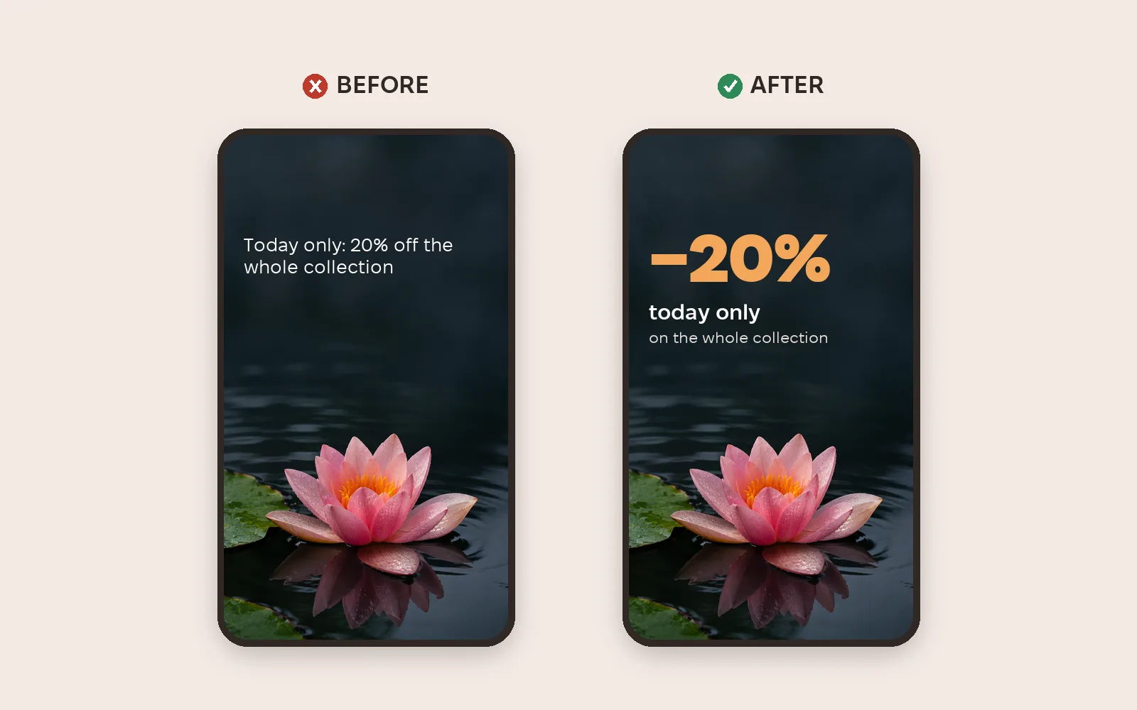
When everything looks the same, nothing stands out. Highlight the key point — a number or a benefit — with size or color.
7. Use the empty space
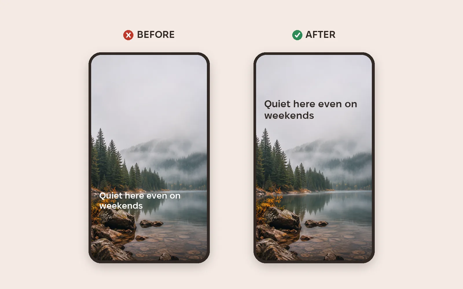
Photos usually have a calm area: sky, fog, water. Put the text there, not over the details.
8. Remove the clutter
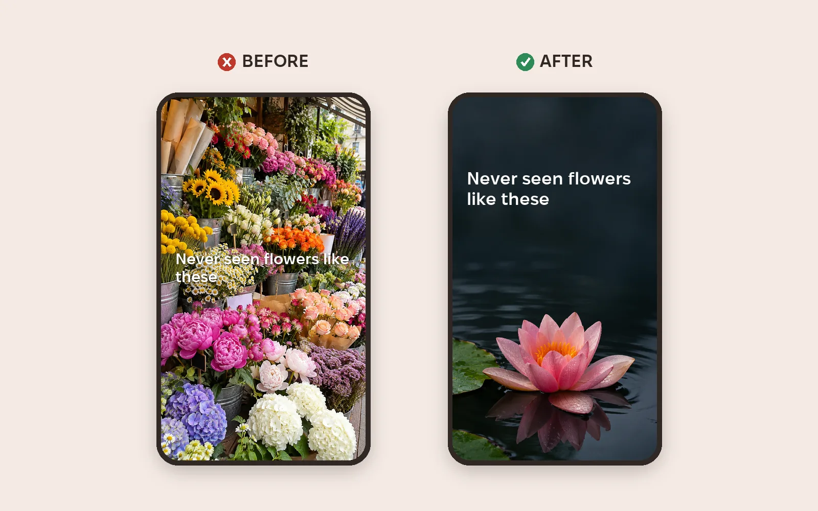
The less noise in the photo, the easier the text is to read and the stronger the message. Sometimes it's better to pick another shot.
9. Simplify the style
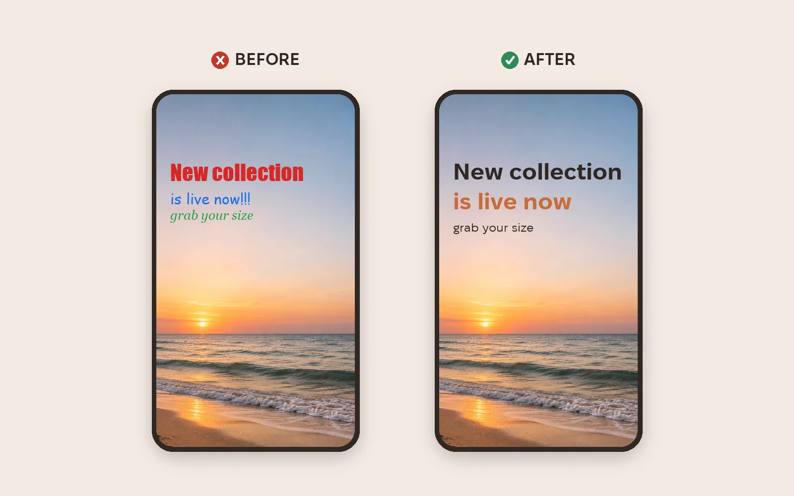
One or two fonts and one accent color. Three fonts and three colors in one Story look messy.
10. Choose readable fonts
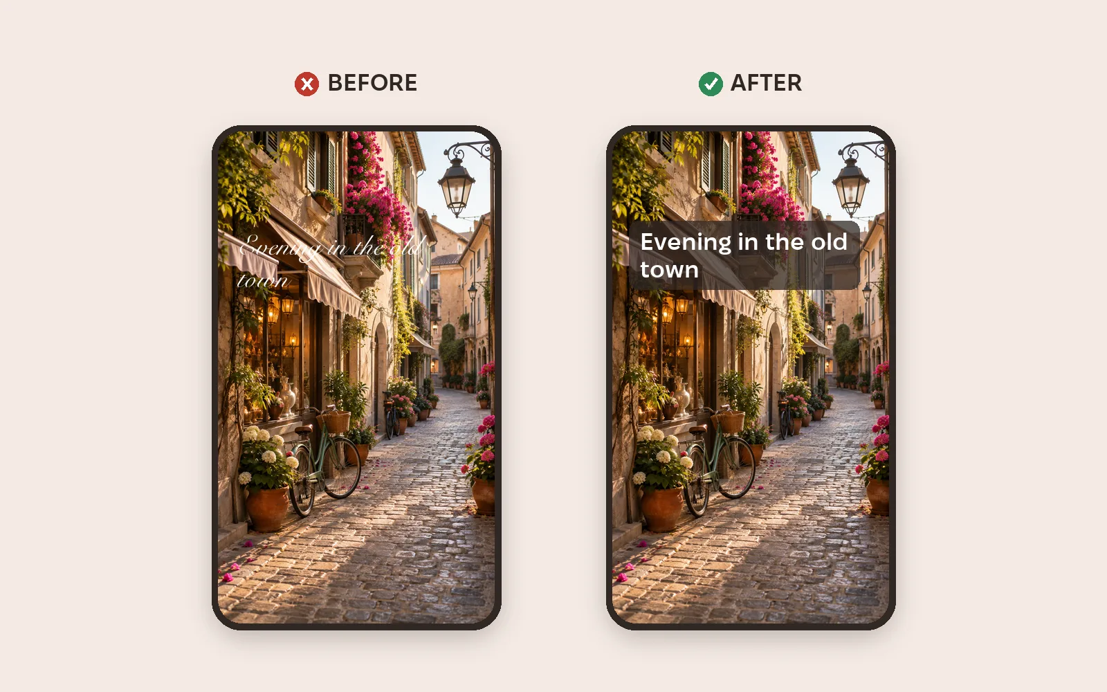
Simple test: glance for one second — could you read it? If not, replace the decorative font.
Safe zones: what the buttons cover
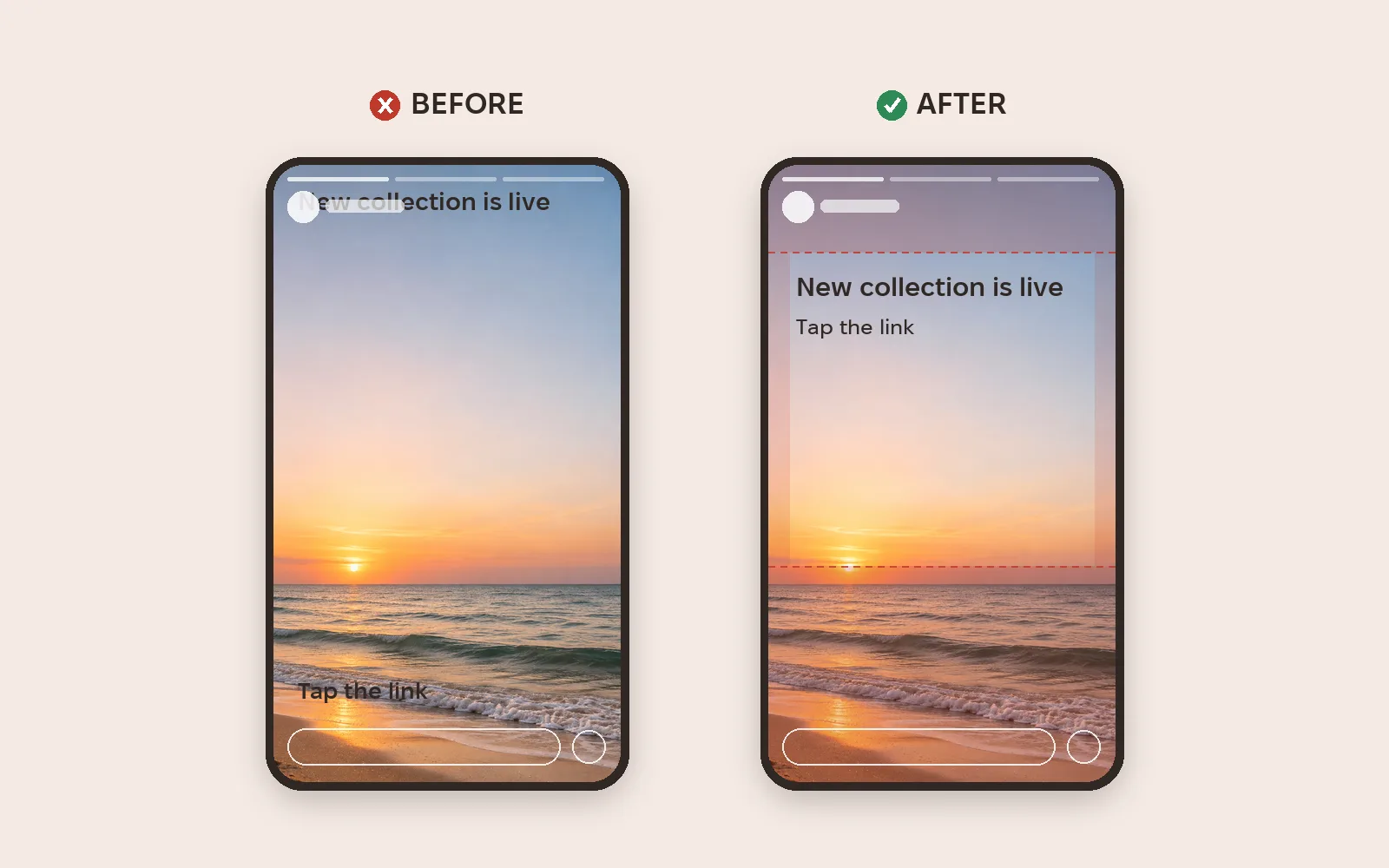
For Stories ads Meta recommends a 9:16 format (1440 × 2560 recommended) and keeping roughly 14% at the top, 35% at the bottom and 6% on each side free of text and logos. That's where the profile icon, call-to-action button and reply field appear.
Metriverra shows which campaigns and ads bring in sales, so it's easy to check whether a new Stories design paid off.
In short
- Contrast and large text come first; nothing else works without them.
- Text in short blocks, aligned on one edge.
- One accent and one or two fonts.
- Text in a calm area of the photo, without clutter.
- For ads, keep 14% top, 35% bottom, 6% sides clear.
Sources: Meta Ads Guide — Instagram Stories · W3C — WCAG 2.2: Contrast (Minimum)