Mobile website design: 10 rules with before-and-after examples
Most online store visitors arrive on a phone, and that's where they decide whether to buy. Here are 10 rules for a mobile website with before-and-after examples and exact button and font sizes based on Apple, Google and WCAG guidance.
Why isn't a mobile site just a shrunken website?
On a phone people tap with a finger, read on a small screen and often use one hand. What's comfortable on a computer becomes tiny, cramped and confusing on a phone. Google also indexes sites by their mobile version, so both search and sales depend on it.
10 rules with examples
1. Make buttons big
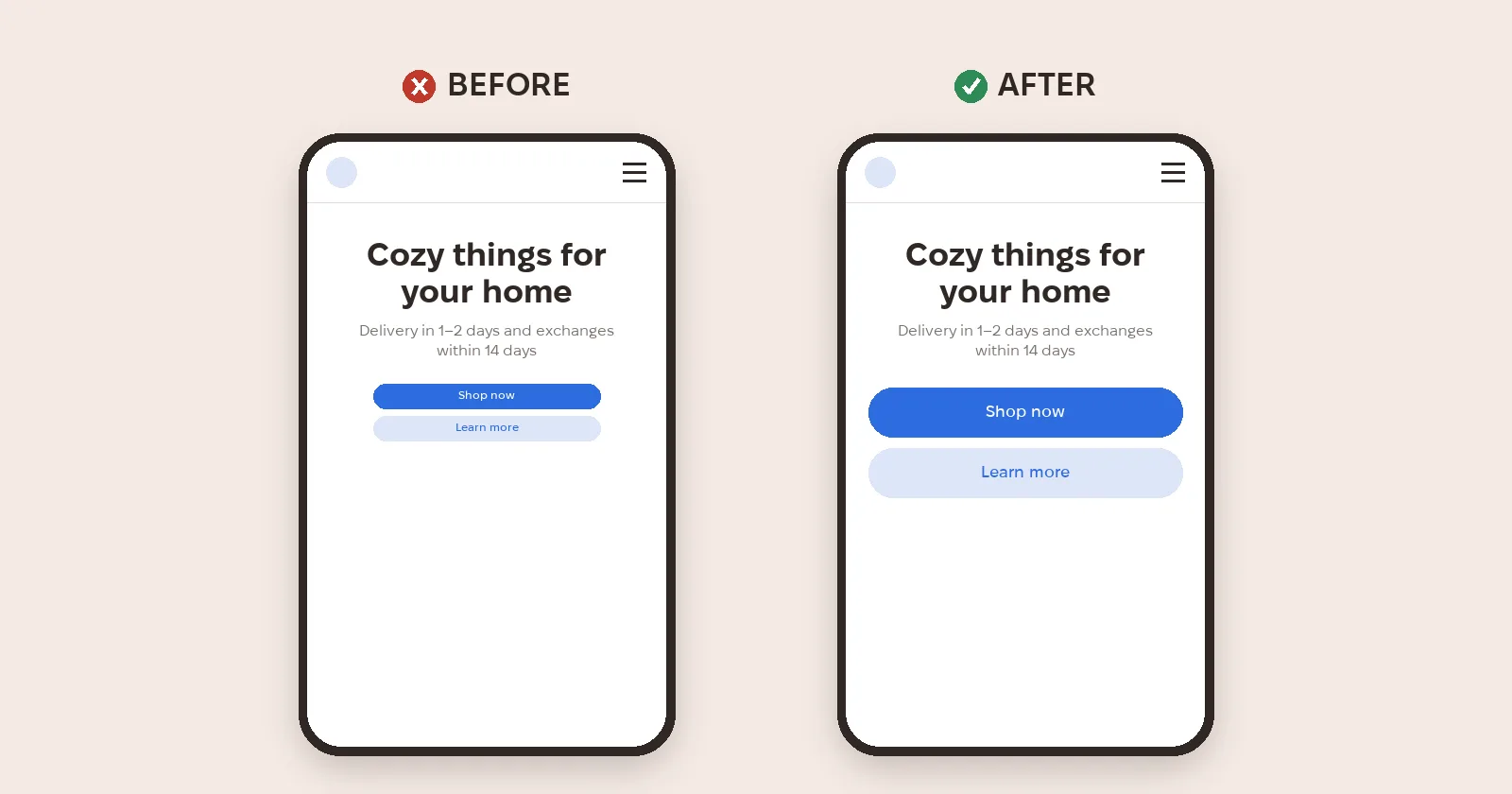
People tap with a finger, not a cursor. Apple recommends a hit target of at least 44 × 44 pt, Android 48 × 48 dp, and the WCAG 2.2 accessibility standard sets a minimum of 24 × 24 px.
2. Make the font bigger
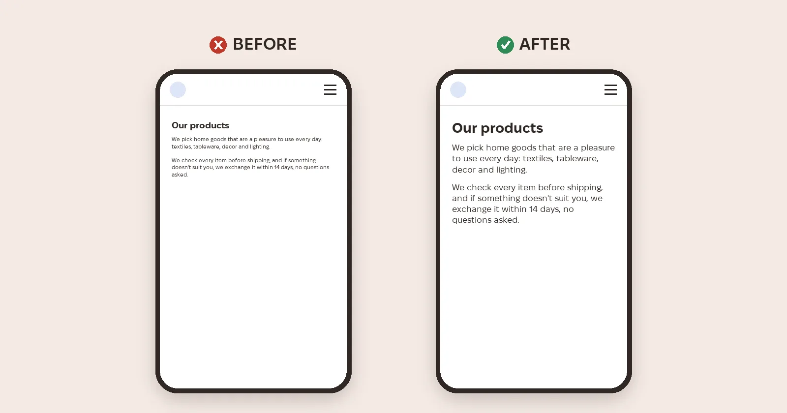
What's fine on a computer is unreadable on a phone. Body text is usually 16 px or more so nobody has to zoom; Google's Lighthouse flagged pages where over 40% of text was smaller than 12 px.
3. Mind the spacing
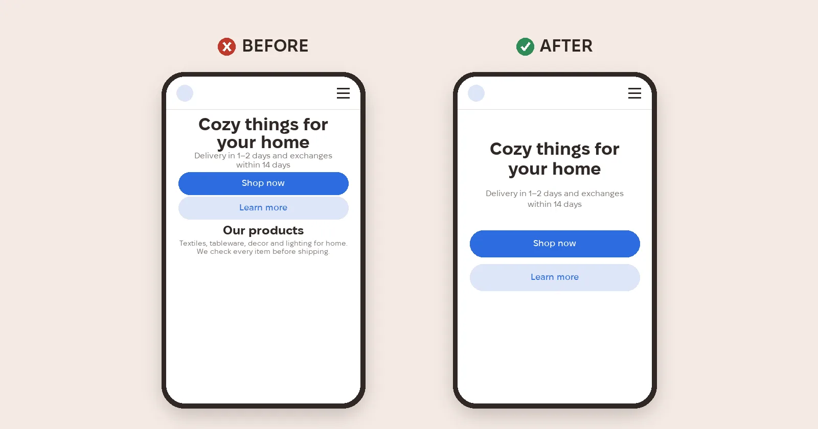
When blocks sit tight together the screen looks cluttered and cheap. You need more white space than you think.
4. Stack buttons vertically
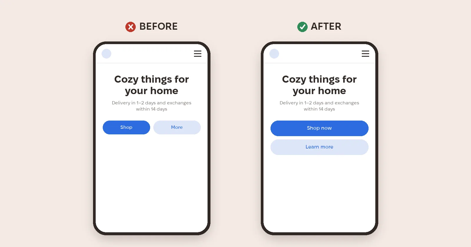
Two buttons side by side on a phone end up narrow. Full-width buttons stacked one under another are easier to hit and cause fewer mis-taps.
5. Show that content scrolls
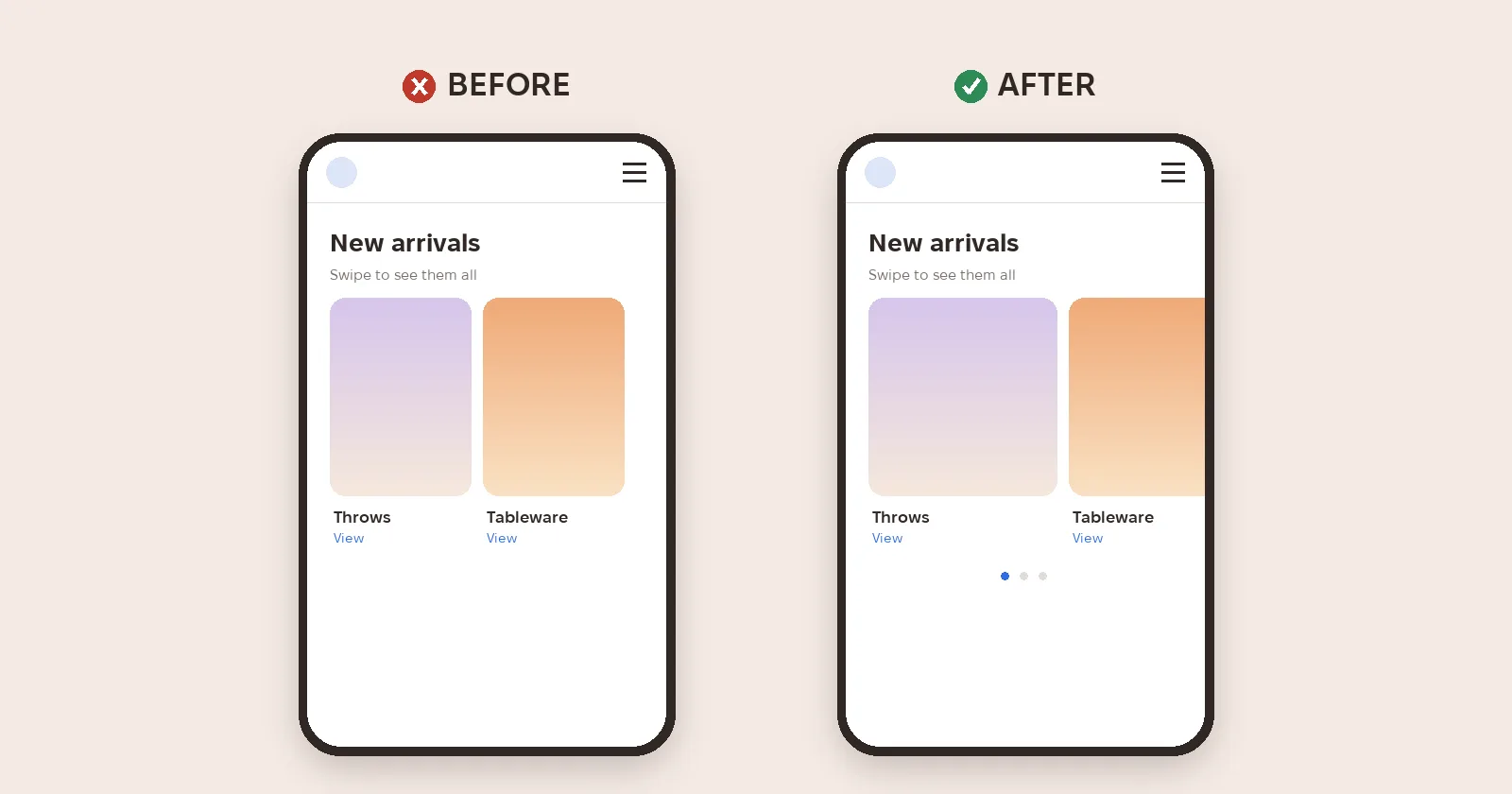
If cards can be swiped, people should see it: the edge of the next card, dots or arrows hint there's more.
6. Shrink the menu
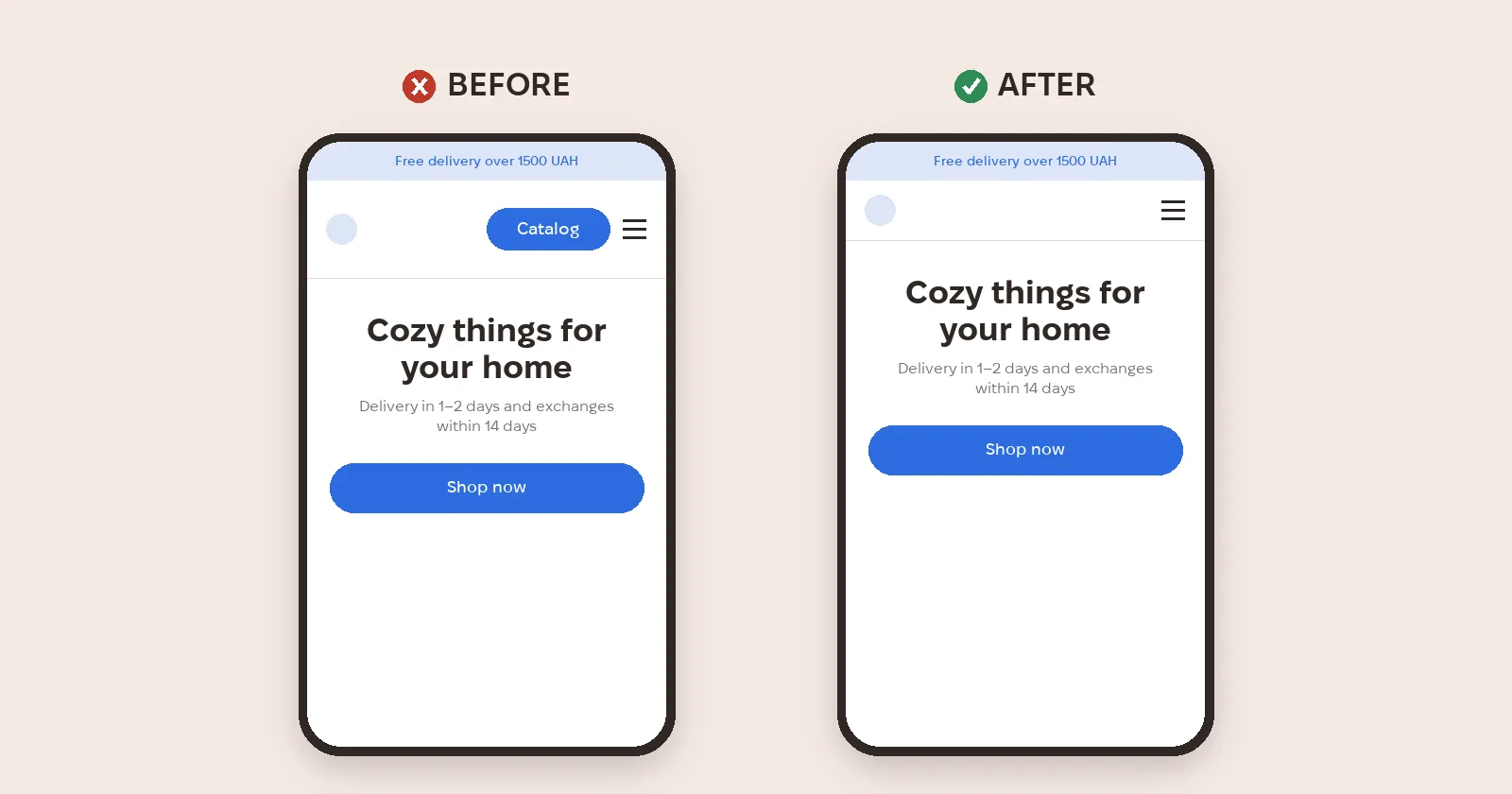
The header shouldn't take half the screen. A compact header with a logo and menu button leaves room for what matters.
7. Hide secondary content
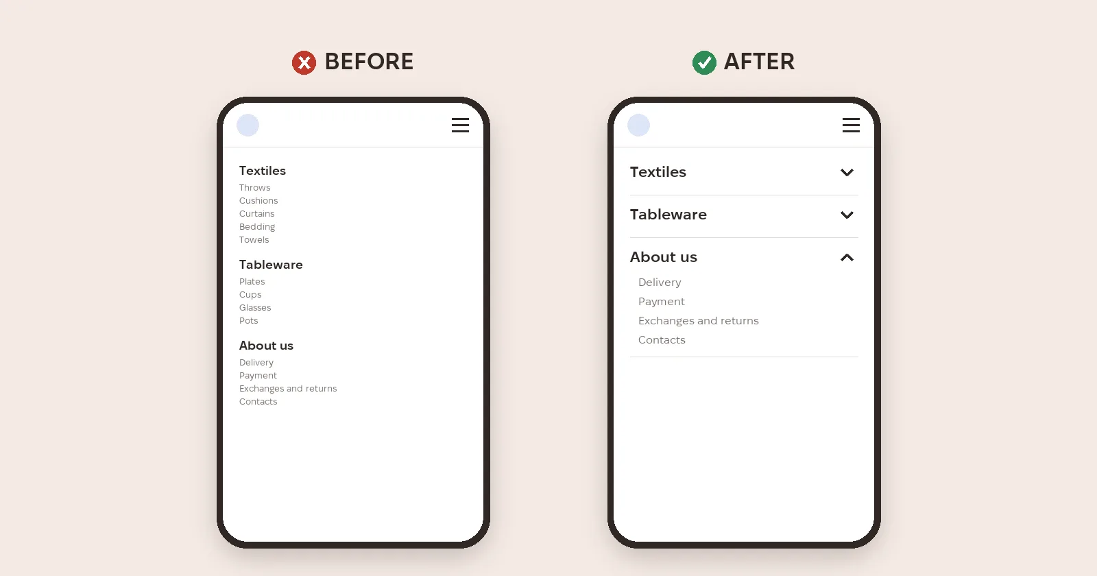
On a phone you don't need everything at once: accordions, tabs and "show more" keep the page clean. Hide it but don't delete it — Google indexes the mobile version, so the content should match desktop.
8. Make contacts tappable
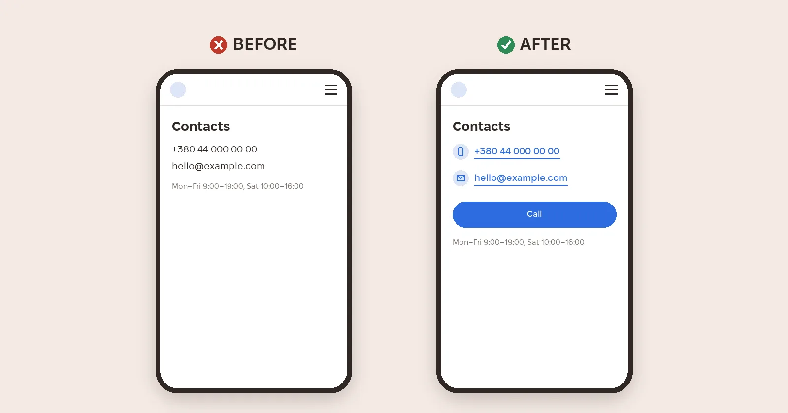
Phone numbers and emails should open with one tap — that's what tel: and mailto: links are for. A "Call" button is even simpler.
9. Don't overload the first screen
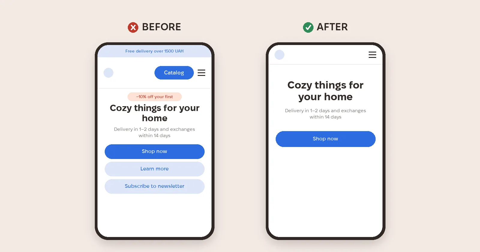
There's little room above the fold: one headline, a short explanation and one main action. Banners, discounts and sign-ups go lower.
10. Don't copy desktop one-to-one
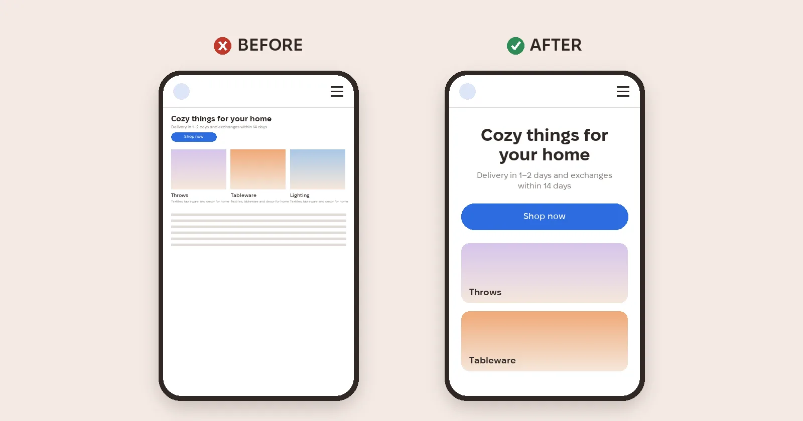
A mobile version isn't a smaller website. Blocks get reordered, three columns become one, and extras are removed.
Metriverra shows how phone and desktop visitors convert, so it's easy to check whether mobile improvements brought in sales.
In short
- Buttons from 44 × 44 pt (Apple) or 48 × 48 dp (Android); the WCAG minimum is 24 × 24 px.
- Body text 16 px or more, with spacing between blocks.
- Full-width stacked buttons; tappable contacts.
- First screen: one main action; secondary content in accordions.
- Mobile is a rebuild, not a shrunken site; content matches desktop.
Sources: Apple — Human Interface Guidelines: Accessibility · Android Developers — Make apps more accessible · W3C — WCAG 2.2: Target Size (Minimum) · Chrome for Developers — Lighthouse: legible font sizes · MDN — The Anchor element · Google Search Central — Mobile-first indexing